
Marketing Dashboard Examples: Real Layouts for SEO, Paid, and Lifecycle Teams
Marketing dashboard examples are ready-to-adapt layouts that show which metrics to put on one screen, how to group them, and how to read them at a glance. The best examples pair every metric with a target and a comparison, so a stakeholder sees status without reading a paragraph. This guide gives concrete dashboard blueprints for SEO, paid media, lifecycle, and executive reporting.
What Makes a Good Marketing Dashboard Example?
A useful example is not a wall of charts; it is a decision surface. Each panel should answer one question a specific person asks weekly. A paid-media manager needs "are we hitting ROAS by campaign?"; a founder needs "is pipeline on track this quarter?" When you copy an example, keep that question in mind and delete any tile that no one on the team will act on.
Three traits separate dashboards people use from dashboards that rot:
- One audience per dashboard. Mixing founder-level and specialist-level metrics produces a screen nobody owns.
- Target lines on everything. A number without a target is a fact, not a signal. Every tile should show actual vs goal.
- Comparison built in. Show period over period or vs plan so the viewer sees movement, not just a snapshot.
SEO Dashboard Example
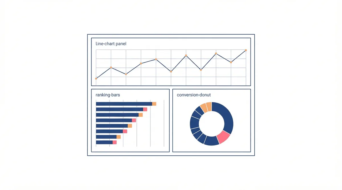
The SEO dashboard answers "is our organic visibility growing, and where is it leaking?" Keep it to the metrics an SEO lead reviews weekly.
| Tile | Metric | Read it as |
|---|---|---|
| Visibility | Non-brand organic sessions, MoM | Top-line organic health |
| Rankings | Keywords in top 10, count and share | Whether effort is converting to positions |
| AI citations | Brand mentions in AI Overviews / answer engines | Emerging discovery channel |
| Technical | Crawl errors, Core Web Vitals pass rate | Leaks that suppress the above |
| Conversions | Organic-assisted demos or signups | Ties SEO to revenue, not just traffic |
Paid Media Dashboard Example
The paid dashboard answers "are we buying pipeline efficiently?" Revenue teams care about efficiency, not raw spend, so lead with the ratio metrics.
| Tile | Metric | Read it as |
|---|---|---|
| Spend pace | Month-to-date spend vs budget | Are we on plan or blowing the cap |
| Efficiency | ROAS and CPA by channel and campaign | Where the budget works |
| Quality | Lead-to-MQL rate from paid | Are we buying real demand or clicks |
| Auction health | Impression share, CPC trend, Quality Score | Are costs moving against us |
| Revenue | Closed-won attributed to paid | The only number finance trusts |
Lifecycle and Email Dashboard Example
Lifecycle answers "are we keeping and growing the users we paid to acquire?" This dashboard is owned by the lifecycle or CRM marketer.
| Tile | Metric | Read it as |
|---|---|---|
| Activation | New-user activation rate, D30 | Are onboarding flows working |
| Engagement | Active users, feature adoption | Stickiness over time |
| Open, click, and conversion rates by flow | Which automations earn their keep | |
| Retention | Logo and revenue churn, NRR | The leakage that kills LTV |
| Expansion | Upsell rate, expansion MRR | Growth inside the base |
Executive Marketing Dashboard Example
The exec dashboard answers "is marketing on track to fund the quarter's pipeline?" One screen, monthly cadence, no jargon. Lead with the two numbers the board cares about: pipeline generated vs target, and CAC vs plan.
| Tile | Metric | Read it as |
|---|---|---|
| Pipeline | Marketing-sourced pipeline vs quarterly target | The single most important line |
| Efficiency | Blended CAC, CAC payback | Are we buying growth sustainably |
| Mix | Spend by channel, % of pipeline | Where the next dollar should go |
| Funnel | MQL to SQL to won conversion | Where the funnel leaks |
How to Build a Dashboard from These Examples
1. Pick the Owner First
Name the single person who will act on the dashboard. If two people need different views, build two dashboards. This single decision removes most clutter.
2. Choose 5 to 8 Tiles
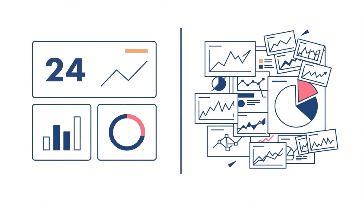
More than eight tiles and the screen stops being scannable. Start from the example closest to your team and cut anything no one will change a decision about this week.
3. Add Targets and Comparisons
Every tile gets a goal line and a period-over-period arrow. A dashboard of raw counts invites "looks fine" complacency; a dashboard of deltas invites action.
4. Wire the Data Source
Pull from GA4, your ad platforms, and your CRM on a schedule. Manual monthly exports rot and lose trust; automated connectors keep the numbers honest. A marketing dashboard is only as good as the pipeline feeding it.
5. Review on a Cadence
A dashboard nobody opens is a sunk cost. Set a standing 15-minute weekly review where the owner reads the deltas aloud and notes one change. That ritual is what turns tiles into decisions.
Common Marketing Dashboard Mistakes
- Vanity metrics with no target. "Followers" or "impressions" without a goal line are decoration.
- One dashboard for everyone. Founders and specialists need different screens; merging them serves neither.
- Too many tiles. Ten-plus panels scatter attention and hide the signal.
- No comparison. A snapshot with no MoM or vs-plan context looks stable even when it is failing.
- Manual data. Hand-built spreadsheets drift from reality and quietly lose credibility.
SaaS Marketing Dashboard Example
A SaaS company needs one dashboard that connects acquisition spend to recurring revenue, because the board judges marketing on pipeline and retention, not likes. Build it in three rows. Top row: new ARR and marketing-sourced pipeline vs target, the two numbers that decide the quarter. Middle row: CAC, CAC payback, and the MQL-to-SQL rate that explains whether top-of-funnel is real demand or noise. Bottom row: activation rate, logo churn, and net revenue retention, which show whether the acquired users stick. The power of this layout is that a single red tile tells a story: if pipeline is up but activation is down, you are buying users who do not stay, and the dashboard says so before the renewal numbers do.
Free vs Paid Dashboard Templates
You do not need to start from a blank canvas. Looker Studio offers free connectors to GA4 and most ad platforms, which is enough for a credible first dashboard if your data lives in those sources. Paid BI tools earn their cost when you blend warehouse data, model custom metrics, or need row-level permissions across teams. The template choice should follow the data, not the logo: if your metrics already live in GA4 and ad platforms, free is fine; if you need revenue joined to marketing touchpoints from a warehouse, pay for the tool that queries it. Either way, copy an example above and adapt the tiles to your one owner.
How Often Should You Refresh a Dashboard?
Dashboards are not set-and-forget. A useful cadence is a weekly 15-minute owner review for operational dashboards (paid, SEO, lifecycle) and a monthly exec review. Quarterly, audit the tile list: delete metrics nobody acted on and add any new question the business is asking. A dashboard that grows without pruning drifts back toward clutter, which is how most rot starts. The refresh ritual matters more than the initial build, because it is what keeps the numbers trusted and the decisions flowing.
Key Takeaways
- Marketing dashboard examples are reusable layouts that pair each metric with a target and a comparison for one audience.
- Build separate dashboards for SEO, paid media, lifecycle, and exec - do not cram them onto one screen.
- Keep 5 to 8 tiles, every tile with a goal line and period-over-period movement.
- Automate the data feed and review weekly, or the dashboard becomes a sunk cost.
- The best dashboard answers one question per panel and removes anything nobody will act on.
Frequently Asked Questions
What Should a Marketing Dashboard Include?
A marketing dashboard should include 5 to 8 metrics each paired with a target and a comparison, chosen for one audience. For paid media that means spend pace, ROAS, CPA, lead quality, and attributed revenue; for SEO it means organic sessions, rankings, technical health, and organic conversions.
How Many Metrics Should Be on a Marketing Dashboard?
Five to eight tiles is the usable range. Fewer than five hides context; more than eight scatters attention and bury the signal. If you have more to show, split them into a second dashboard for a different owner.
What Is the Difference Between a Marketing Dashboard and a Report?
A dashboard is a live, visual screen someone checks on a cadence to make decisions; a report is a periodic narrative that explains what happened and why. Dashboards surface the delta; reports explain it.
Which Tools Build Marketing Dashboards?
Common tools are Looker Studio, the native analytics inside GA4 and ad platforms, and BI tools like Tableau or Power BI. The tool matters less than the data pipeline feeding it and the weekly review ritual that keeps it trusted.
How Do I Build an Executive Marketing Dashboard?
Lead with marketing-sourced pipeline vs the quarterly target and blended CAC vs plan, then show channel mix and funnel conversion. Keep it to one screen, monthly cadence, no jargon, so the board sees at a glance whether marketing is funding the quarter.